
This notebook contains an excerpt from the Python Programming and Numerical Methods - A Guide for Engineers and Scientists, the content is also available at Berkeley Python Numerical Methods.
The copyright of the book belongs to Elsevier. We also have this interactive book online for a better learning experience. The code is released under the MIT license. If you find this content useful, please consider supporting the work on Elsevier or Amazon!
< CHAPTER 12. Visualization and Plotting | Contents | 12.2 3D Plotting >
2D Plotting
In Python, the matplotlib is the most important package that to make a plot, you can have a look of the matplotlib gallery and get a sense of what could be done there. Usually the first thing we need to do to make a plot is to import the matplotlib package. In Jupyter notebook, we could show the figure directly within the notebook and also have the interactive operations like pan, zoom in/out, and so on using the magic command - %matplotlib notebook. Let’s see some examples.
import numpy as np
import matplotlib.pyplot as plt
%matplotlib notebook
The basic plotting function is plot(x,y). The plot function takes in two lists/arrays, x and y, and produces a visual display of the respective points in x and y.
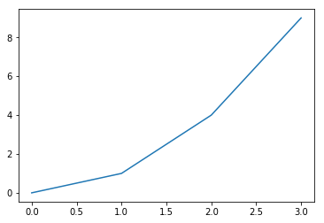
TRY IT! Given the lists x = [0, 1, 2, 3] and y = [0, 1, 4, 9], use the plot function to produce a plot of x versus y.
x = [0, 1, 2, 3]
y = [0, 1, 4, 9]
plt.plot(x, y)
plt.show()
You will notice in the above figure that by default, the plot function connects each point with a blue line. To make the function look smooth, use a finer discretization points. The plt.plot function did the main job to plot the figure, and plt.show() is telling Python that we are done plotting and please show the figure. Also, you can see some buttons beneath the plot that you could use it to move the line, zoom in or out, save the figure. Note that, before you plot the next figure, you need to turn off the interactive plot by pressing the stop interaction button on the top right of the figure. Otherwise, the next figure will be plotted in the same frame. Or we could simply using the magic function %matplotlib inline to turn off the interactive features.
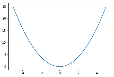
TRY IT! Make a plot of the function \(f(x) = x^2 for -5\le x \le 5\).
%matplotlib inline
x = np.linspace(-5,5, 100)
plt.plot(x, x**2)
plt.show()
To change the marker or line, you can put a third input argument into plot, which is a string that specifies the color and line style to be used in the plot. For example, plot(x,y,’ro’) will plot the elements of x against the elements of y using red, r, circles, ‘o’. The possible specifications are shown below in the table.
Symbol |
Description |
Symbol |
Description |
|---|---|---|---|
b |
blue |
T |
T |
g |
green |
s |
square |
r |
red |
d |
diamond |
c |
cyan |
v |
triangle (down) |
m |
magenta |
^ |
triangle (up) |
y |
yellow |
< |
triangle (left) |
k |
black |
> |
triangle (right) |
w |
white |
p |
pentagram |
. |
point |
h |
hexagram |
o |
circle |
- |
solid |
x |
x-mark |
: |
dotted |
+ |
plus |
-. |
dashdot |
* |
star |
– |
dashed |
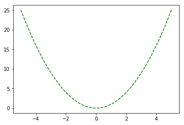
TRY IT! Make a plot of the function \(f(x) = x^2 for -5\le x \le 5\) using a dashed green line.
x = np.linspace(-5,5, 100)
plt.plot(x, x**2, 'g--')
plt.show()
Before the plt.show() statement, you can add in and plot more datasets within one figure.
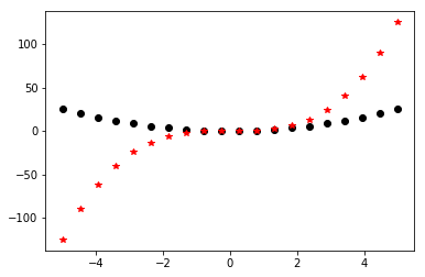
TRY IT! Make a plot of the function \(f(x) = x^2 and g(x) = x^3 for -5\le x \le 5\). Use different colors and markers for each function.
x = np.linspace(-5,5,20)
plt.plot(x, x**2, 'ko')
plt.plot(x, x**3, 'r*')
plt.show()
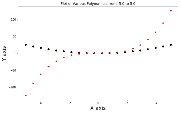
It is customary in engineering and science to always give your plot a title and axis labels so that people know what your plot is about. Besides, sometimes you want to change the size of the figure as well. You can add a title to your plot using the title function, which takes as input a string and puts that string as the title of the plot. The functions xlabel and ylabel work in the same way to name your axis labels. For changing the size of the figure, we could create a figure object and resize it. Note, every time we call plt.figure function, we create a new figure object to draw something on it.
TRY IT! Add a title and axis labels to the previous plot. And make the figure larger with width 10 inches, and height 6 inches.
plt.figure(figsize = (10,6))

x = np.linspace(-5,5,20)
plt.plot(x, x**2, 'ko')
plt.plot(x, x**3, 'r*')
plt.title(f'Plot of Various Polynomials from {x[0]} to {x[-1]}')
plt.xlabel('X axis', fontsize = 18)
plt.ylabel('Y axis', fontsize = 18)
plt.show()
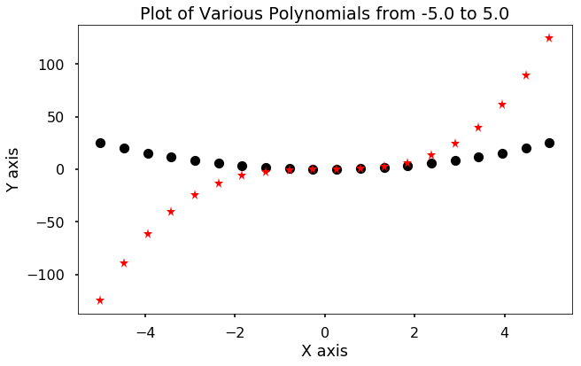
We can see that we could change any part of the figure, such as the x and y axis label size by specify a fontsize argument in the plt.xlabel function. But there are some pre-defined styles that we could use to automatically change the style. Here is the list of the styles.
print(plt.style.available)
['seaborn-dark', 'seaborn-darkgrid', 'seaborn-ticks', 'fivethirtyeight', 'seaborn-whitegrid', 'classic', '_classic_test', 'fast', 'seaborn-talk', 'seaborn-dark-palette', 'seaborn-bright', 'seaborn-pastel', 'grayscale', 'seaborn-notebook', 'ggplot', 'seaborn-colorblind', 'seaborn-muted', 'seaborn', 'Solarize_Light2', 'seaborn-paper', 'bmh', 'tableau-colorblind10', 'seaborn-white', 'dark_background', 'seaborn-poster', 'seaborn-deep']
One of my favorite is the seaborn style, we could change it using the plt.style.use function, and let’s see if we change it to ‘seaborn-poster’, it will make everything bigger.
plt.style.use('seaborn-poster')
plt.figure(figsize = (10,6))

x = np.linspace(-5,5,20)
plt.plot(x, x**2, 'ko')
plt.plot(x, x**3, 'r*')
plt.title(f'Plot of Various Polynomials from {x[0]} to {x[-1]}')
plt.xlabel('X axis')
plt.ylabel('Y axis')
plt.show()
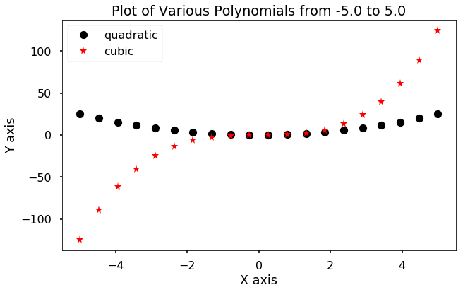
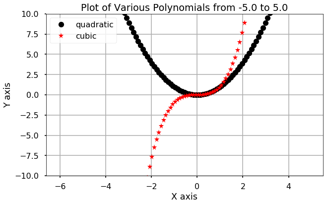
You can add a legend to your plot by using the legend function. And add a label argument in the plot function. The legend function also takes argument of loc to indicate where to put the legend, try to change it from 0 to 10.
plt.figure(figsize = (10,6))

x = np.linspace(-5,5,20)
plt.plot(x, x**2, 'ko', label = 'quadratic')
plt.plot(x, x**3, 'r*', label = 'cubic')
plt.title(f'Plot of Various Polynomials from {x[0]} to {x[-1]}')
plt.xlabel('X axis')
plt.ylabel('Y axis')
plt.legend(loc = 2)
plt.show()
Finally, you can further customize the appearance of your plot to change the limits of each axis using the xlim or ylim function. Also, you can use the grid function to turn on the grid of the figure.
TRY IT! Change the limits of the plot so that x is visible from -6 to 6 and y is visible from -10 to 10. Turn the grid on.
plt.figure(figsize = (10,6))

x = np.linspace(-5,5,100)
plt.plot(x, x**2, 'ko', label = 'quadratic')
plt.plot(x, x**3, 'r*', label = 'cubic')
plt.title(f'Plot of Various Polynomials from {x[0]} to {x[-1]}')
plt.xlabel('X axis')
plt.ylabel('Y axis')
plt.legend(loc = 2)
plt.xlim(-6.6)
plt.ylim(-10,10)
plt.grid()
plt.show()
We can create a table of plots on a single figure using the subplot function. The subplot function takes three inputs: the number of rows of plots, the number of columns of plots, and to which plot all calls to plotting functions should plot. You can move to a different subplot by calling the subplot again with a different entry for the plot location.
There are several other plotting functions that plot x versus y data. Some of them are scatter, bar, loglog, semilogx, and semilogy. scatter works exactly the same as plot except it defaults to red circles (i.e., plot(x,y,’ro’) is equivalent to scatter(x,y)). The bar function plots bars centered at x with height y. The loglog, semilogx, and semilogy functions plot the data in x and y with the x and y axis on a log scale, the x axis on a log scale and the y axis on a linear scale, and the y axis on a log scale and the x axis on a linear scale, respectively.
TRY IT! Given the lists x = np.arange(11) and \(y = x^2\), create a 2 by 3 subplot where each subplot plots x versus y using plot, scatter, bar, loglog, semilogx, and semilogy. Title and label each plot appropriately. Use a grid, but a legend is not necessary.
x = np.arange(11)
y = x**2

plt.figure(figsize = (14, 8))

plt.subplot(2, 3, 1)
plt.plot(x,y)
plt.title('Plot')
plt.xlabel('X')
plt.ylabel('Y')
plt.grid()

plt.subplot(2, 3, 2)
plt.scatter(x,y)
plt.title('Scatter')
plt.xlabel('X')
plt.ylabel('Y')
plt.grid()

plt.subplot(2, 3, 3)
plt.bar(x,y)
plt.title('Bar')
plt.xlabel('X')
plt.ylabel('Y')
plt.grid()

plt.subplot(2, 3, 4)
plt.loglog(x,y)
plt.title('Loglog')
plt.xlabel('X')
plt.ylabel('Y')
plt.grid(which='both')

plt.subplot(2, 3, 5)
plt.semilogx(x,y)
plt.title('Semilogx')
plt.xlabel('X')
plt.ylabel('Y')
plt.grid(which='both')

plt.subplot(2, 3, 6)
plt.semilogy(x,y)
plt.title('Semilogy')
plt.xlabel('X')
plt.ylabel('Y')
plt.grid()

plt.tight_layout()

plt.show()
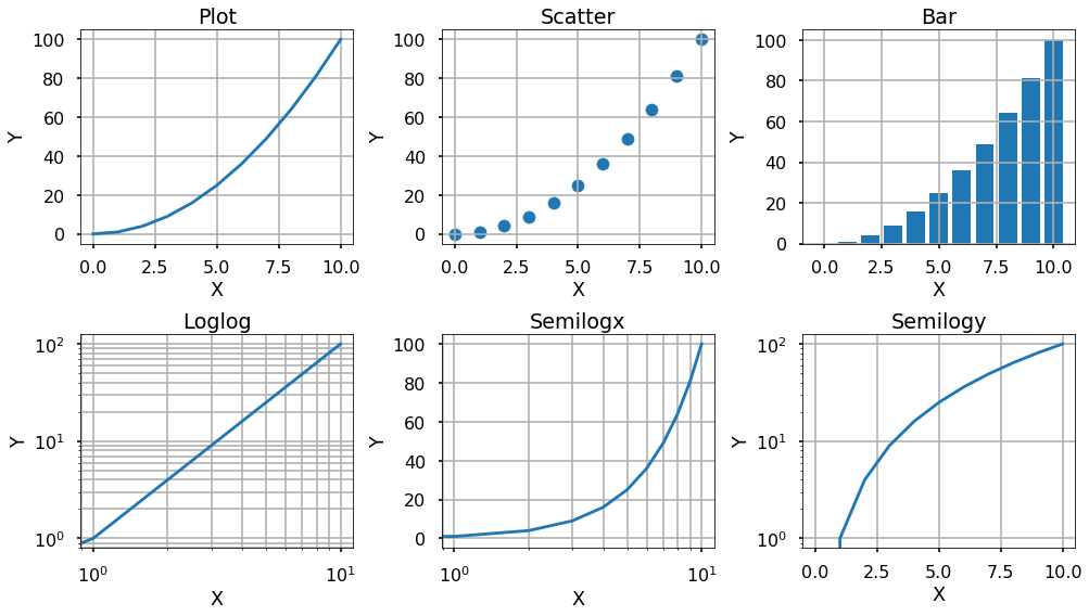
We could see that at the end of our plot, we used plt.tight_layout to make the sub-figures not overlap with each other, you can try and see the effect without this statement.
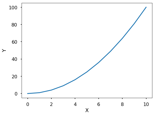
Besides, sometimes, you want to save the figures as a specific format, such as pdf, jpeg, png, and so on. You can do this with the function plt.savefig.
plt.figure(figsize = (8,6))
plt.plot(x,y)
plt.xlabel('X')
plt.ylabel('Y')
plt.savefig('image.pdf')
Finally, there are other functions for plotting data in 2D. The errorbar function plots x versus y data but with error bars for each element. The polar function plots θ versus r rather than x versus y. The stem function plots stems at x with height at y. The hist function makes a histogram of a dataset; boxplot gives a statistical summary of a dataset; and pie makes a pie chart. The usage of these functions are left to your exploration. Do remember to check the examples on the matplotlib gallery.
< CHAPTER 12. Visualization and Plotting | Contents | 12.2 3D Plotting >