
This notebook contains an excerpt from the Python Programming and Numerical Methods - A Guide for Engineers and Scientists, the content is also available at Berkeley Python Numerical Methods.
The copyright of the book belongs to Elsevier. We also have this interactive book online for a better learning experience. The code is released under the MIT license. If you find this content useful, please consider supporting the work on Elsevier or Amazon!
< 12.4 Animations and Movies | Contents | CHAPTER 13. Parallel Your Python >
Summary
Visualizing data is an essential tool in engineering and science.
Python has many different library of plotting tools that can be used to visualize data.
2D, 3D plots and maps are usually used in engineering and science to communicate research.
Videos are a sequence of static images that displayed at certain speed.
Problems
A cycloid is the curve traced by a point located on the edge of a wheel rolling along a flat surface. The \((x,y)\) coordinates of a cycloid generated from a wheel with radius, \(r\), can be described by the parametric equations:
\(x = r(\phi - \sin{\phi})\)
\(y = r(1 - \cos{\phi})\)
where \(\phi\) is the number of radians that the wheel has rolled through.
Generate a plot of the cycloid for \(0 \le \phi \le 2\pi\) using 1000 increments and \(r = 3\). Give your plot a title and labels. Turn the grid on and modify the axis limits to make the plot neat.
Consider the following function:
\(y(x) = \sqrt{\frac{100(1-0.01x^2)^2 + 0.02x^2}{(1-x^2)^2 + 0.1x^2}}.\)
Generate a \(2 \times 2\) subplot of \(y(x)\) for \(0 \le x \le 100\) using plot, semilogx, semilogy, and loglog. Use a fine enough discretization in x to make the plot appear smooth. Give each plot axis labels and a title. Turn the grid on. Which plot seems to convey the most information?.
Plot the functions \(y_1(x) = 3 + \exp{-x}\sin{(6x)}\) and \(y_2(x) = 4 + \exp{(-x)}\cos{(6x)}\) for \(0 \le x \le 5\) on a single axis. Give the plot axis labels, a title, and a legend.
Generate 1000 normally distributed random numbers using the np.random.randn function. Look up the help for the plt.hist function. Use the plt.hist function to plot a histogram of the randomly generated numbers. Use the plt.hist function to distribute the randomly generated numbers into 10 bins. Create a bar graph of output of hist using the plt.bar function. It should look very similar to the plot produced by plt.hist.
Do you think that the np.random.randn function is a good approximation of a normally distributed number?.
Let the number of students with A’s, B’s, C’s, D’s, and F’s be contained in the list grade_dist = [42, 85, 67, 20, 5]. Use the plt.pie function to generate a pie chart of grade_dist. Put a title and legend on the pie chart.
Let \(-4 \le x \le 4, -3 \le y \le 3\), and \(z(x,y) = \frac{xy(x^2 - y^2)}{x^2 + y^2}\). Create arrays x and y with 100 evenly spaced points over the interval. Create meshgrids X and Y for x and y using the meshgrid function. Compute the matrix Z from X and Y . Create a \(1 \times 2\) subplot where the first figure is the 3D surface Z plotted using plt.plot_surface and the second figure is the 3D wireframe plot using plt.plot_wireframe, respectively. Give each axis a title and axis labels.
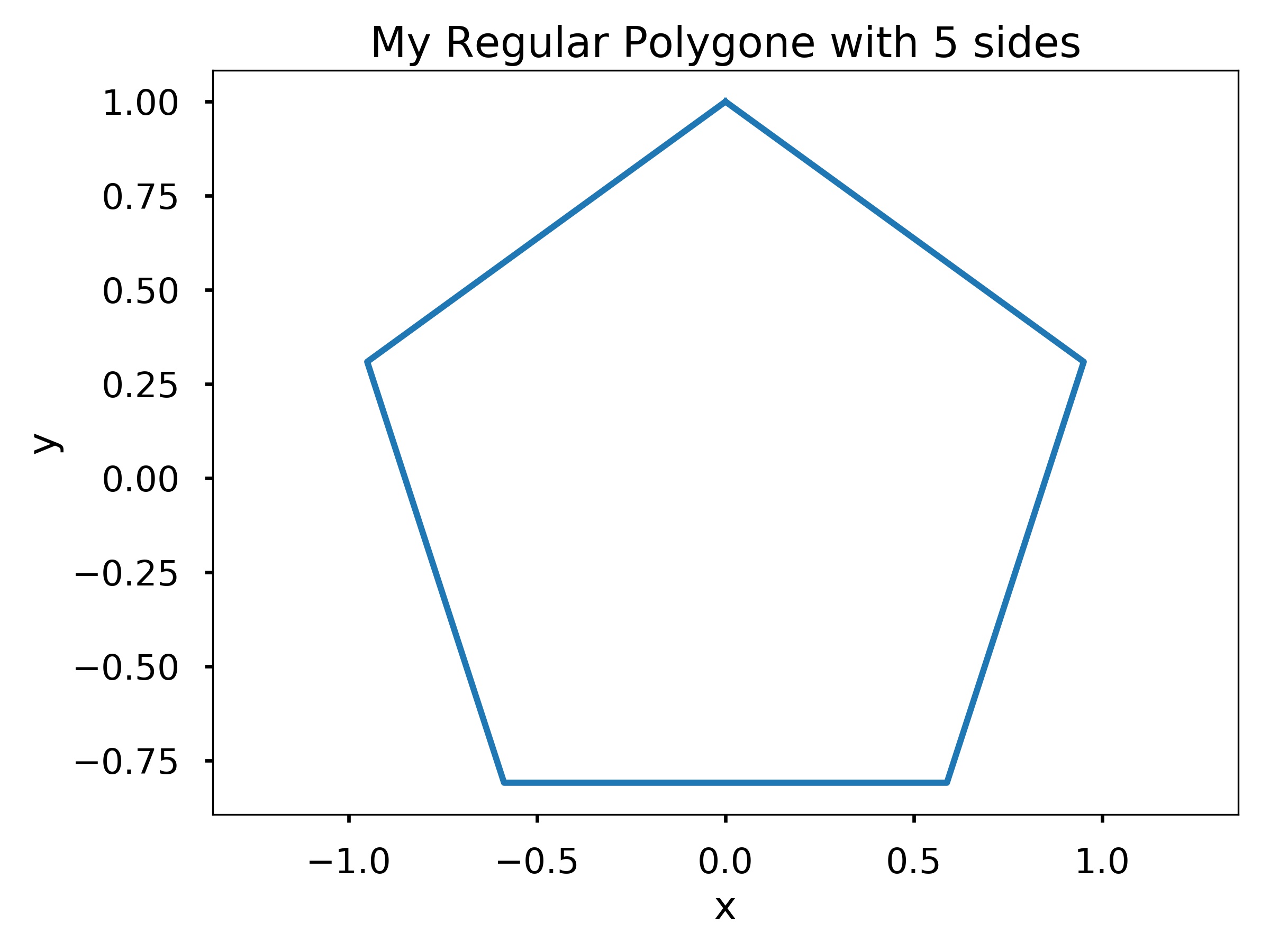
Write a function my_polygon(n) that plots a regular polygon with n sides and radius 1. Recall that the radius of a regular polygon is the distance from its centroid to the vertices. Use plt.axis(‘equal’) to make the polygon look regular. Remember to give the axes a label and a title. You can use plt.title to title the plot according to the number of sides. Hint: This problem is significantly easier if you think in polar coordinates. Recall that a complete revolution around the unit circle is \(2\pi\) radians. Note: The first and last point on the polygon should be the point associated with the polar coordinate angles, \(0\) and \(2\pi\), respectively.
Test cases:
my_polygon(5)
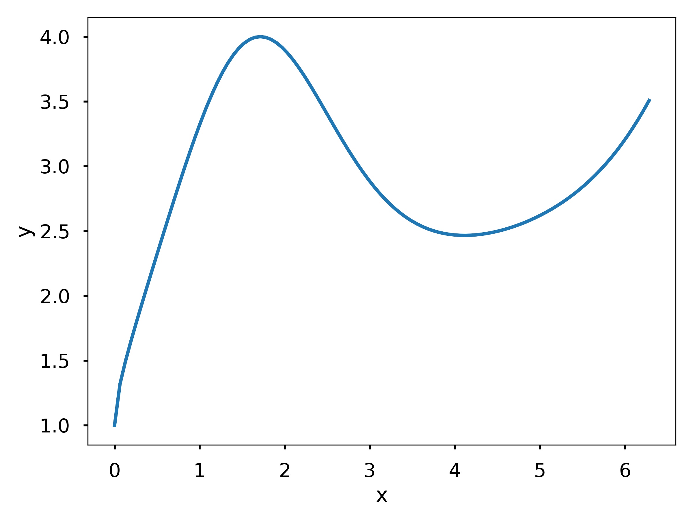
Write a function my_fun_plotter(f, x) where f is a lambda function and x is an array. The function should plot f evaluated at x. Remember to label the x- and y-axis.
Test cases:
my_fun_plotter(lambda x: np.sqrt(x) + np.exp(np.sin(x)), np.linspace(0, 2*np.pi, 100))
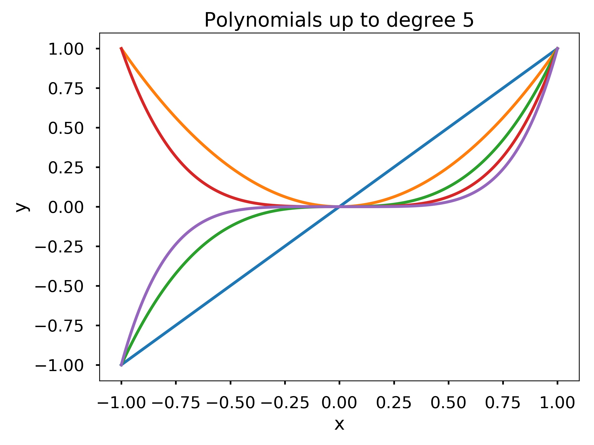
Write a function with my_poly_plotter (n,x) that plots the polynomials \(p_k(x) = x^k\) for \(k = 1,\ldots,n\). Make sure your plot has axis labels and a title.
Test cases:
my_poly_plotter(5, np.linspace(-1, 1, 200))
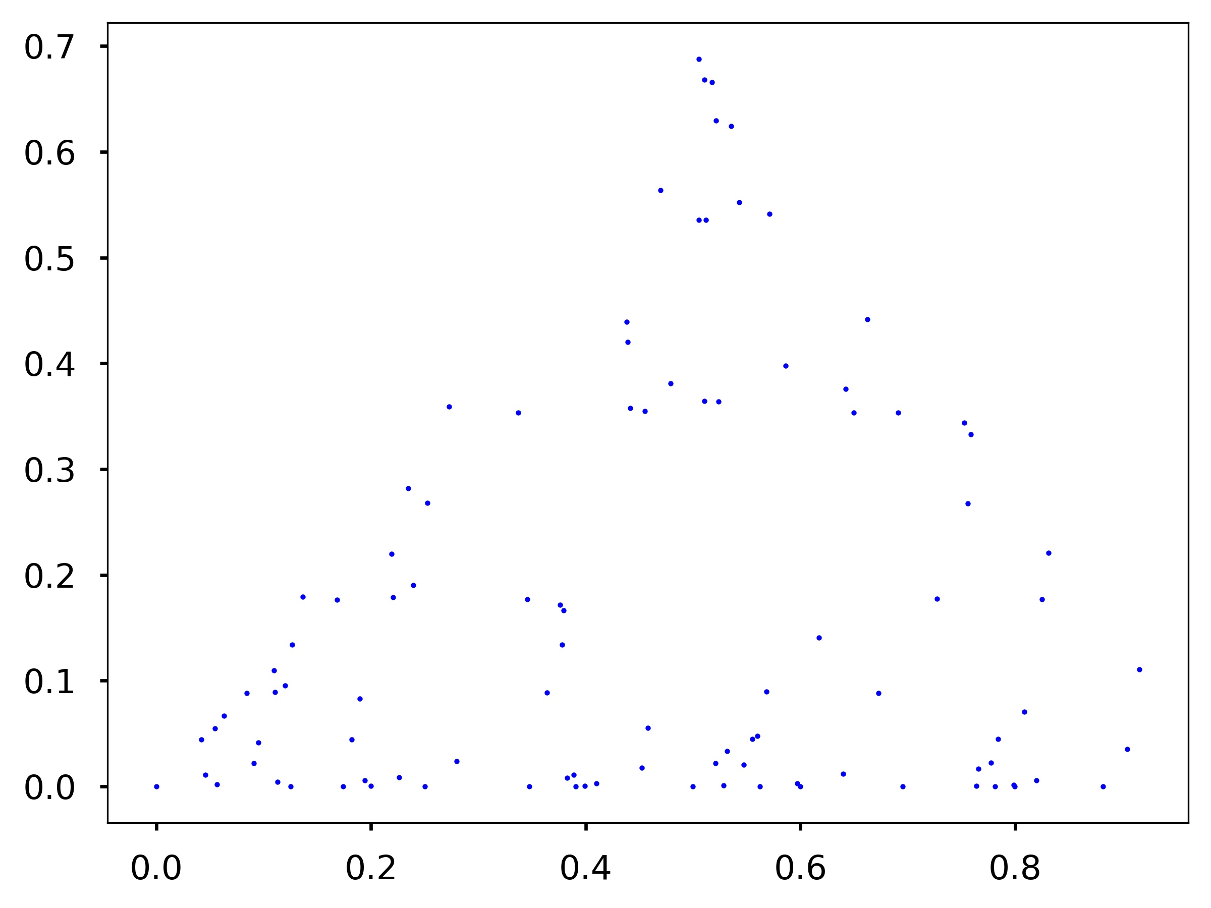
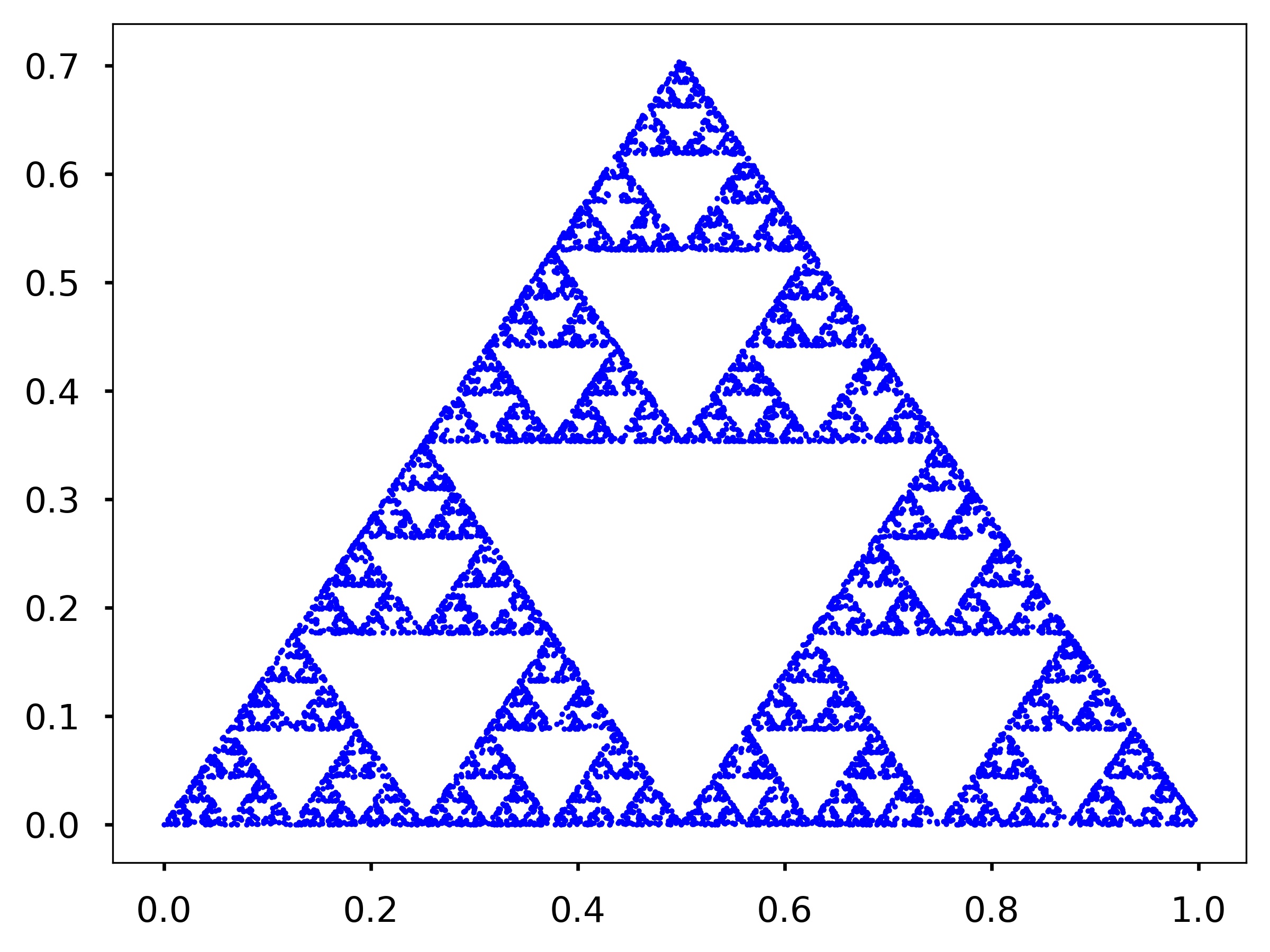
Assume you have three points at the corner of an equilateral triangle, \(P_1 = (0,0), P_2 = (0.5,\sqrt{2}/2)\), and \(P_3 = (1,0)\). Now you want to generate another set of points \(p_i = (x_i, y_i)\) such that \(p_1 = (0,0)\) and \(p_{i+1}\) is the midpoint between \(p_i\) and \(P_1\) with 33% probability, the midpoint between \(p_i\) and \(P_2\) with 33% probability, and the midpoint between \(p_i\) and \(P_3\) with 33% probability. Write a function my_sierpinski (n) that generates the points \(p_i\) for \(i = 1,\cdots,n\). The function should make a plot of the points using blue dots (i.e., ‘b.’ as the third argument to the plt.plot function).
Test cases:
my_sierpinski(100)
my_sierpinski(10000)
Assume you are generating a set of points \((x_i, y_i)\) where \(x_1 = 0\) and \(y_1 = 0\). The points \((x_i, y_i)\) for \(i = 2,\cdots,n\) is generated according to the following probabilistic relationship:
With 1% probability:
\(x_i = 0\)
\(y_i = 0.16y_{i-1}\)
With 7% probability:
\(x_i = 0.2x_{i-1} - 0.26y_{i-1}\)
\(y_i = 0.23x_{i-1} + 0.22y_{i-1} + 1.6\)
With 7% probability:
\(x_i = -0.15x_{i-1} + 0.28y_{i-1}\)
\(y_i = 0.26x_{i-1} + 0.24y_{i-1} + 0.44\)
With 85% probability:
\(x_i = 0.85x_{i-1} + 0.04y_{i-1}\)
\(y_i = -0.04x_{i-1} + 0.85y_{i-1} + 1.6\)
Write a function my_fern (n) that generates the points \((x_i,y_i)\) for \(i = 1,\ldots,n\) and plots them using blue dots. Also use plt.axis(‘equal’) and plt.axis(‘off’) to make the plot looks nicer.
Test cases:
my_fern(100)
Try your function for n = 10000. The image generated is called a stochastic fractal. Many times it is cheaper (i.e. requires less space) to store the fractal generating code rather than the image. This makes stochastic fractals useful for image compression.
my_fern(10000)
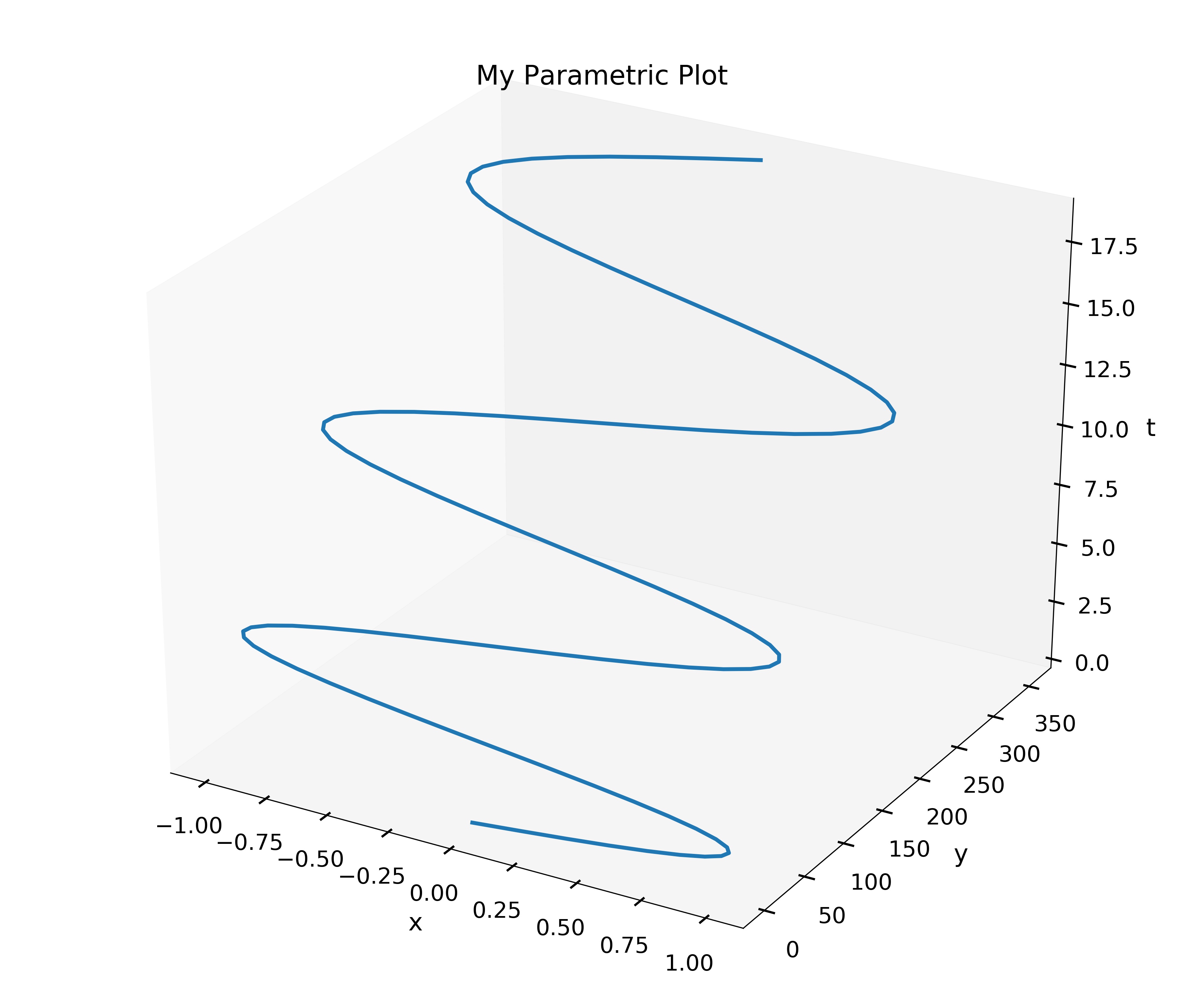
Write a function my_parametric_plotter (x,y,t) where x and y are function objects x (t) and y (t), respectively, and t is a one-dimensional~array. The function my_parametric_plotter should produce the curve \((x(t), y(t), t)\) in a three-dimensional plot. Be sure to give your plot a title and axis labels.
Test cases:
from mpl_toolkits import mplot3d
f = lambda t: np.sin(t)
g = lambda t: t**2
my_parametric_plotter(f, g, np.linspace(0, 6*np.pi, 100))
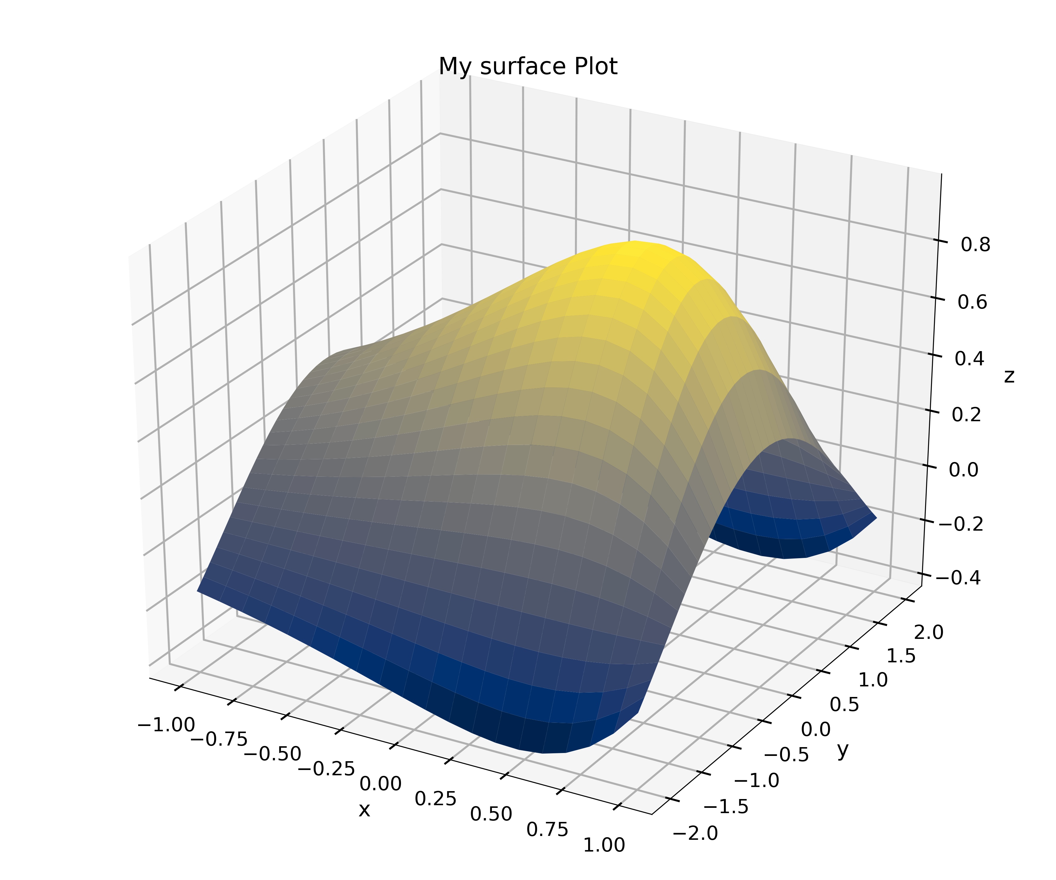
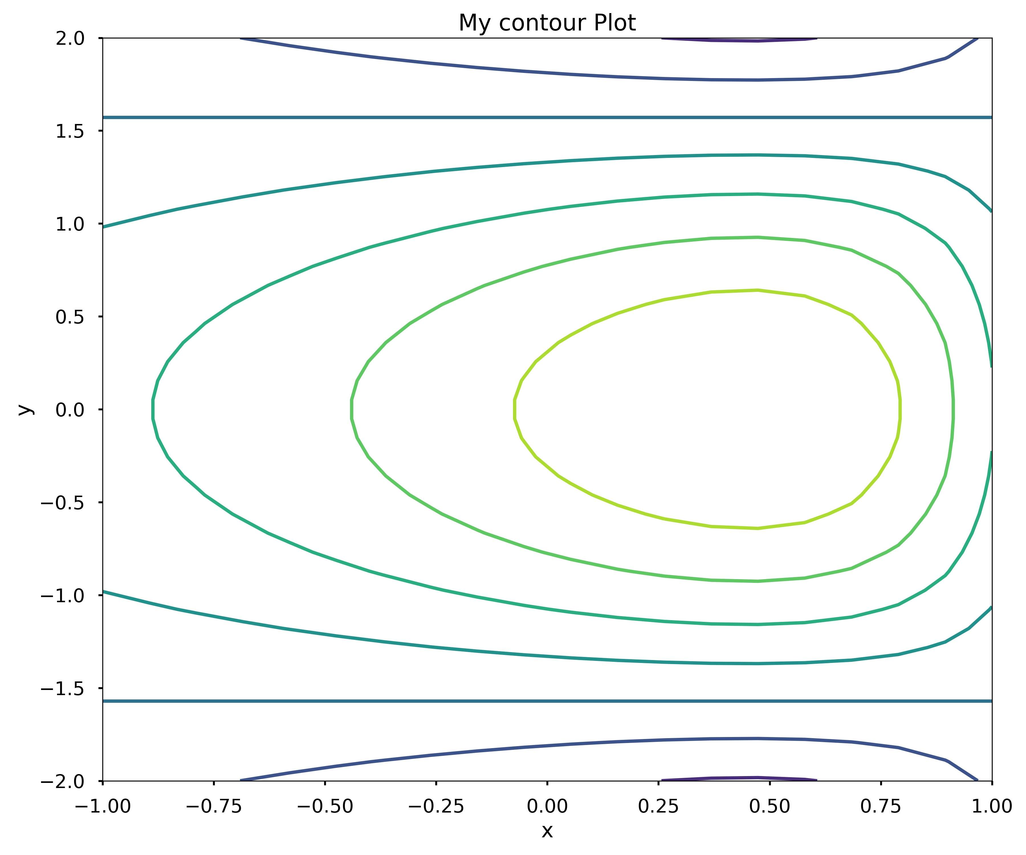
Write a function my_surface_plotter(f, x, y, option) where f is a function object f (x,y). The function my_surface_plotter should produce a 3D surface plot of f (x,y) using plot_surface if option is the string ‘surface’. It should produce a contour plot of f (x,y) if the option is the string ‘contour’. Assume that x and y are one-dimensional arrays or lists. Remember to give the plot a title and axis labels.
Test cases:
from mpl_toolkits import mplot3d
f = lambda x, y: np.cos(y)*np.sin(np.exp(x))
my_surface_plotter(f, np.linspace(-1, 1, 20), np.linspace(-2, 2, 40), 'surface')
my_surface_plotter(f, np.linspace(-1, 1, 20), np.linspace(-2, 2, 40), 'contour')
Write a line of code that generates the following error:
ValueError: x and y must have same first dimension, ...
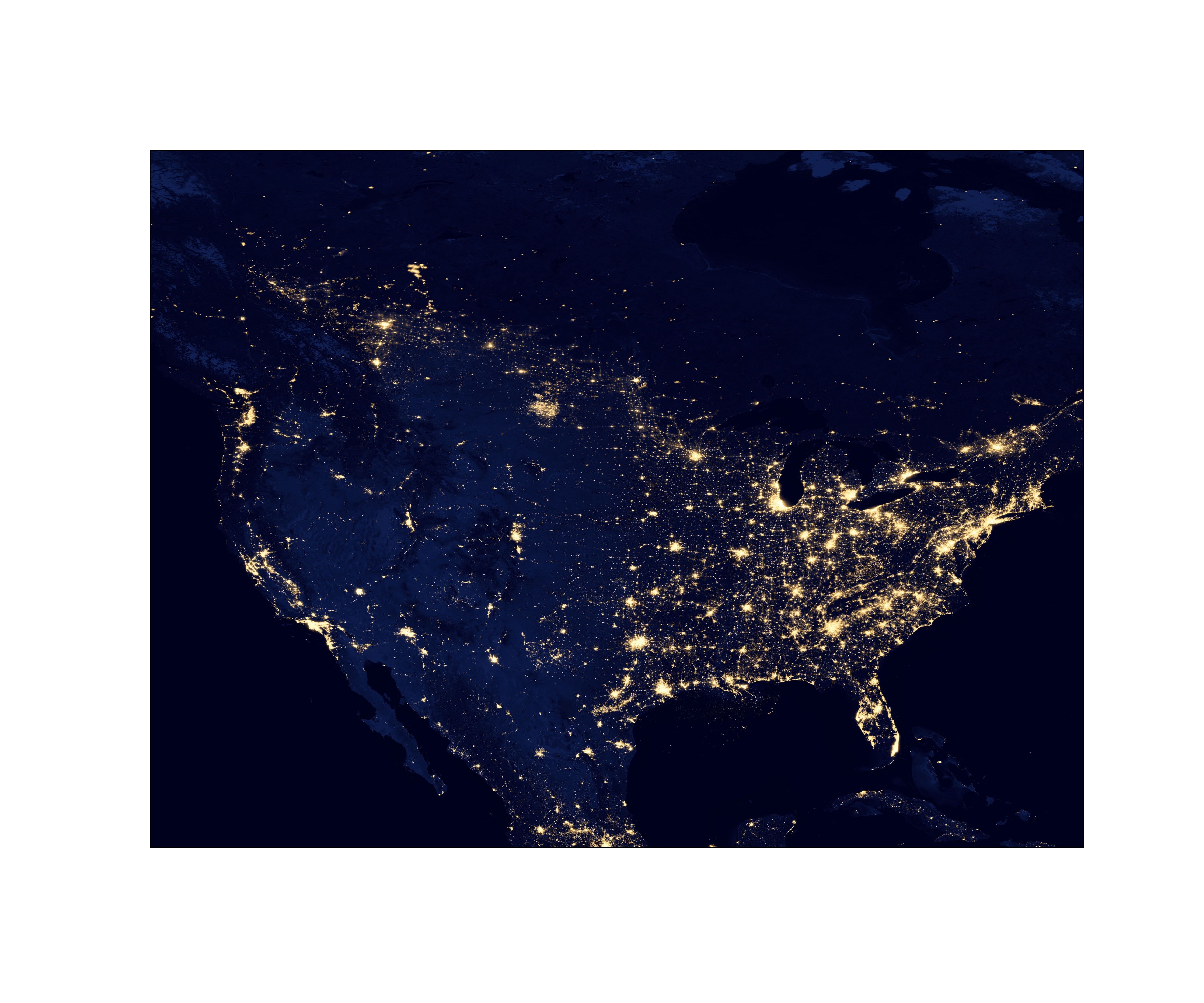
We could make maps using different Web Map Tile Service (WMTS) online in cartopy. Plot an earth-night map as the one showing below for the main part of North America, with the extent latitude from 19.50139 to 64.85694 and longitude from -128.75583 to -68.01197. Hint: check out the gallery on cartopy website.
< 12.4 Animations and Movies | Contents | CHAPTER 13. Parallel Your Python >